Skechers
Merging legacy systems for a next-gen employee intranet
Summary
Skechers is an American multinational footwear company headquartered in Manhattan Beach, California. The brand is now the third largest athletic footwear brand in the United States.
The goal of this project was to combine and transform Skechers' fragmented outdated intranet and employee service portal into a cohesive, efficient, and visually modern platform that catered to the diverse needs of their users.
Project Duration
March - August 2023
My Role
Lead UI/UX Designer:
Design strategy, wireframes, mockups, prototyping, visual design, design QA
The Challenge
Enterprise intranets are messy places.
Skechers needed to integrate the functionality of both their existing Employee Self Service Portal and their SharePoint site to create a unified "one-stop shop" for their employees make requests, submit IT tickets, stay up to date on company news, and access important company documents.
Our team faced the challenge of not only merging these two platforms but also ensuring that the new intranet would be user-friendly and streamlined.
The Process
1. Discovery
A series of in-depth workshops were held with the client to gain a thorough understanding of the project's goals and objectives. These collaborative sessions were essential in aligning our vision with the client's expectations and ensuring that we addressed all key aspects of the redesign.
Current State Evaluation
What is working?
An evaluation of the current employee self service portal revealed certain features were working well today, and provided value to the users which we would enhance in the new design.
Ability to make requests and report problems
Access important documents
Quick answers to FAQs
What is not working?
We also identified features that were underutilized or unnecessary, determining they should be omitted from the new combined intranet to streamline the user experience.
Company photo library
Community pages
Future wants and needs
I also discussed some potential new features that could be beneficial for the users, based on their feedback and the client's vision for the future.
Ways to stay up to date on company events and news
Communicating important corporate announcements
Easier way to track requests
More central document mgmt
Key Requirements
Intuitive navigation and proper content hierarchy
A taxonomy structure that allowed users to to easily find and access the information they needed
Visually appealing and contemporary design that would enhance user experience and engagement
Built on the ServiceNow platform
Understanding the Users
An essential part of these workshops was defining and understanding the different user personas and how they used the intranet.
I identified all use cases for users from each of the nine different departments that were to be represented on the new intranet.
Top Use Cases
Self Help - Submit requests and read knowledge articles
Check IT ticket status
Stay up to date on company news
View company events
Access and view important documents
This analysis also provided insights into the specific needs and tasks of each department. It allowed us to understand the unique requirements of a diverse user base and come up with the core features the new intranet would feature.
Core Features
Get Help: Make Requests and get IT assistance
News: A central news feed to keep employees informed about company updates
File Management: Users needed a streamlined way to manage and share files
Quick links: Easy access to frequently used links and resources
Company Events: Keep up to date on on events (happening both in person and digitally) that were happening within the company
2. Research
User Surveys
Surveys were distributed to end users and key stakeholders from 9 different departments that would be using the new intranet. These surveys were designed to gather direct feedback about their experiences and expectations.
Sample survey questions:
How would you define the intranet and how do you utilize the intranet?
Based on your current intranet page, what are some of the features that you enjoy and find critical?
Based on your current intranet page; what do you or your users struggle with?
Common User Pain Points
Content is inconsistent across departments
News is not kept up to date or relevant
Navigation is confusing. It’s Hard to find content
The intranet appears cluttered. Not visually appealing
The events calendar is not user friendly
Not sure how/where to check a ticket status
3. Ideation
Technical Discussions
I engaged in comprehensive discussions with the development team to strategize the implementation of our design system into the new intranet. This meeting was crucial for determining which widgets would be directly utilized and which would require customization to meet Skechers' specific requirements.
We assessed each widget's functionality, flexibility, and how well it aligned with the project goals. Our goal was to leverage our pre-built widgets strengths while ensuring the final product catered precisely to the client’s needs.
4. Wireframes
Following discovery and research, I embarked on an exploratory phase to conceptualize various layouts for the homepage. This involved creating multiple design iterations, each emphasizing different features and the hierarchical arrangement of those features.
We considered various factors, such as user roles, the frequency of feature usage, and the overall user experience. Our aim was to design a homepage that was intuitively structured, allowing users to access critical information and tools effortlessly.
Homepage
We first presented three variations of the homepage to the client for feedback. Each concept highlighted the core features in different ways. The goal was to get feedback on the content hierarchy, functionality, and layout of the page.
Concepts where then then taken and iterated upon, incorporating feedback from both the client and our internal team until one version was agreed upon.
Interior Pages
I repeated the same process with all of the interioir pages until we had a full set of user journeys demonstrating the functionality of the portal.
5. Validation
At this point in the project it is good to do some validating of our ideas through user testing with tools such as Maze. I like to make sure that my assumptions are correct and that we are addressing any holes in the design before we move into hi-fidelity.
Unfortunately, the client opted not to allocate funding for us to independently conduct testing and validation of the design during the project. This decision prevented me from gathering direct user feedback through our standard testing procedures to ensure the design met all user needs and expectations.
Despite this limitation, Skechers took the initiative to perform their own user testing with a selected group of employees. With each iteration of wireframes they brought in users and key stakeholders from the different departments to run their own user testing sessions. This gave my team valuable insights that would be applied to the next iteration.
6. Visual Design
Branding Guidlines
Skechers provided their branding guidelines to use as I created hi-fidelity mockups of the key user journeys.
Hi-Fidelity Mockups & Prototyping
I focused on balancing aesthetics with functionality, ensuring that the most important features were prominently displayed without overwhelming the user.
Once the key pages in all the user journeys were mocked up, a clickable prototype was created in Figma for the client to review and sign off on the final design.
Key Features
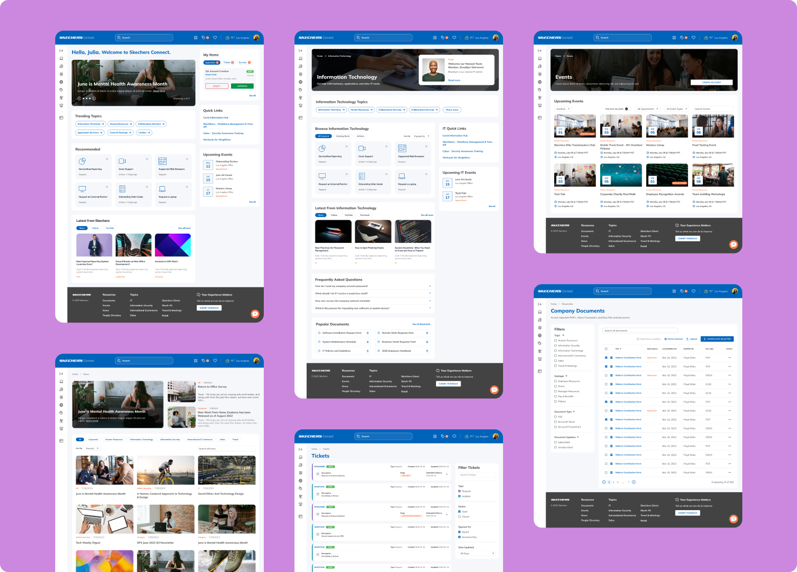
Homepage
The homepage is meant to be just an entry point and featured content from the key areas of the portal.
The “Recommended” and “Trending Topics” content on the page is dynamic through user criteria within ServiceNow to only show the most viewed content keeping it fresh and relevant.
Flexible Department Landing Pages
Dedicated department page templates were designed to allow flexibility in displayed content based on department's needs. This allowed greater ability for employees to self help.
Centralized News Page
One central page for users to view and browse company news from all departments.
Events Management
Allows users and admins to easily view and manage events from all around the company.
Tickets List
Clean and easy-to-navigate ticket list page where user can check the status of their requests and incident tickets.
Document Management
A central place to store and manage hundreds of documents for end users and admins alike. This allows users to access important documents such as PDFs, Word, Excel and Powerpoint templates.
The feedback from a user testing group indicated several key improvements.
Results
Easier, More Intuitive Navigation
Users reported that the redesigned navigation structure was significantly more straightforward and user-friendly compared to the previous system. The new layout allowed them to find necessary information and tools more efficiently, thereby enhancing their overall experience and productivity.
Cleaner Look and Feel
The updated visual design was well-received, with users praising its modern and clean aesthetic. The fresh, streamlined appearance made the intranet more visually appealing and pleasant to use, contributing to a more engaging user experience.
More Relevant Content Displayed on the Homepage
Users noted that the homepage now featured content that was much more relevant to their needs. The redesign effectively prioritized important information and functionalities, ensuring that users had quick and easy access to the most critical content and resources. This improvement was a direct response to the previously cluttered and confusing layout, and it significantly enhanced the usability of the intranet.
Conclusion & Next Steps
Positive feedback from Skechers' internal testing affirmed that our design solutions successfully addressed the major pain points of the previous intranet system. The improvements in navigation, visual design, and content relevance indicated that the new intranet design was well-received and effectively met the needs of its users.


